AutoFit in PowerPoint: Turn it OFF
Posted
by Daniel Moth
on Daniel Moth
See other posts from Daniel Moth
or by Daniel Moth
Published on Mon, 26 Apr 2010 00:54:46 GMT
Indexed on
2010/04/26
1:04 UTC
Read the original article
Hit count: 603
AboutPresenting
Once a feature has shipped, it is very hard to eliminate it from the next release. If I was in charge of the PowerPoint product, I would not hesitate for a second to remove the dreadful AutoFit feature.

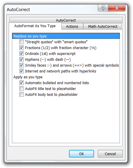
Fortunately, AutoFit can be turned off on a slide-by-slide basis and, even better, globally: go to the PowerPoint "Options" and under "Proofing" find the "AutoCorrect Options…" button which brings up the dialog where you need to uncheck the last two checkboxes (see the screenshot to the right).
AutoFit is the ability for the user to keep hitting the Enter key as they type more and more text into a slide and it magically still fits, by shrinking the space between the lines and then the text font size. It is the root of all slide evil. It encourages people to think of a slide as a Word document (which may be your goal, if you are presenting to execs in Microsoft, but that is a different story). AutoFit is the reason you fall asleep in presentations.
AutoFit causes too much text to appear on a slide which by extension causes the following:
- When the slide appears, the text is so small so it is not readable by everyone in the audience. They dismiss the presenter as someone who does not care for them and then they stop paying attention.
- If the text is readable, but it is too much (hence the AutoFit feature kicked in when the slide was authored), the audience is busy reading the slide and not paying attention to the presenter. Humans can either listen well or read well at the same time, so when they are done reading they now feel that they missed whatever the speaker was saying. So they "switch off" for the rest of the slide until the next slide kicks in, which is the natural point for them to pick up paying attention again.
- Every slide ends up with different sized text. The less visual consistency between slides, the more your presentation feels unprofessional. You can do better than dismiss the (subconscious) negative effect a deck with inconsistent slides has on an audience.
In contrast, the absence of AutoFit
- Leads to consistency among all slides in a deck with regards to amount of text and size of said text.
- Ensures the text is readable by everyone in the audience (presuming the PowerPoint template is designed for the room where the presentation is delivered).
- Encourages the presenter to create slides with the minimum necessary text to help the audience understand the basic structure, flow, and key points of the presentation. The "meat" of the presentation is delivered verbally by the presenter themselves, which is why they are in the room in the first place.
- Following on from the previous point, the audience can at a quick glance consume the text on the slide when it appears and then concentrate entirely on the presenter and what they have to say.
You could argue that everything above has nothing to do with the AutoFit feature and all to do with the advice to keep slide content short. You would be right, but the on-by-default AutoFit feature is the one that stops most people from seeing and embracing that truth.
In other words, the slides are the tool that aids the presenter in delivering their message, instead of the presenter being the tool that advances the slides which hold the message. To get there, embrace terse slides: the first step is to turn off this horrible feature (that was probably introduced due to the misuse of this tool within Microsoft). The next steps are described on my next post.
Comments about this post welcome at the original blog.
© Daniel Moth or respective owner