When do you use a circular slider/knob in a good user interface?
Posted
by Koning Baard
on Stack Overflow
See other posts from Stack Overflow
or by Koning Baard
Published on 2010-06-12T13:42:43Z
Indexed on
2010/06/12
13:52 UTC
Read the original article
Hit count: 306
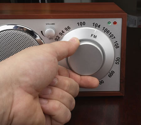
As I am familiar with some synthesizers, I often user real life circular sliders (e.g. to control the master volume), also called knobs. Like this one:

Sometimes I also find these controls in virtual applications (yes I like extreme minimalism =P):

But most of them are irritating, confusing or just wrong, and simple sliders could be used instead, making the UI much better. What are the advantages of circular sliders like the one in the screenshot above? And when do you use them? Thanks
© Stack Overflow or respective owner