Chart Control in ASP.Net 4 – Second Part
Posted
by sreejukg
on ASP.net Weblogs
See other posts from ASP.net Weblogs
or by sreejukg
Published on Fri, 28 Jan 2011 22:39:00 GMT
Indexed on
2011/01/28
23:26 UTC
Read the original article
Hit count: 618
Couple of weeks before, I have written an introduction about the chart control available in .Net framework. In that article, I explained the basic usage of the chart control with a simple example. You can read that article from the url http://weblogs.asp.net/sreejukg/archive/2010/12/31/getting-started-with-chart-control-in-asp-net-4-0.aspx.
In this article I am going to demonstrate how one can generate various types of charts that can be generated easily using the ASP.Net chart control. Let us recollect the data sample we were working in the previous sample. The following is the data I used in the previous article.
| id | SaleAmount | SalesPerson | SaleType | SaleDate | CompletionStatus (%) |
| 1 | 1000 | Jack | Development | 2010-01-01 | 100 |
| 2 | 300 | Mills | Consultancy | 2010-04-14 | 90 |
| 3 | 4000 | Mills | Development | 2010-05-15 | 80 |
| 4 | 2500 | Mike | eMarketting | 2010-06-15 | 40 |
| 5 | 1080 | Jack | Development | 2010-07-15 | 30 |
| 6 | 6500 | Mills | Consultancy | 2010-08-24 | 65 |
In this article I am going to demonstrate various graphical reports generated from this data with the help of chart control. The following are the reports I am going to generate
1. Representation of share of Sales by each Sales person.
2. Representation of share of sales data according to sale type
3. Representation of sales progress over time period
I am going to demonstrate how to bind the chart control programmatically. In order to facilitate this, I created an aspx page named “SalesAnalysis.Aspx” to my project. In the page I added the following controls
1. Dropdownlist control – with id ddlAnalysisType, user will use this to choose the type of chart they want to see.
2. A Button control – with id btnSubmit , by clicking this button, the chart based on the dropdownlist selection will be shown to the user
3. A label Control – with id lblMessage, to display the message to the user, initially this will ask the user to select an option and click on the button.
4. Chart control – with id chrtAnalysis, by default, I set visible = false so that during the page load the chart will be hidden to the users.
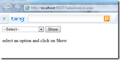
The following is the initial output of the page.
Generating chart for salesperson share
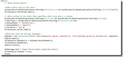
Now from Visual Studio, I have double clicked on the button; it created the event handler btnSubmit_Click. In the button Submit event handler, I am using a switch case to execute the corresponding SQL statement and bind it to the chart control. The below is the code for generating the sales person share chart using a pie chart.
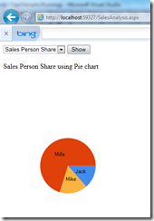
The above code produces the following output
The steps for creating the above chart can be summarized as follows.
You specify a chart area, then a series and bind the chart to some x and y values. That is it.
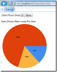
If you want to control the chart size and position, you can set the properties for the ChartArea.Position element. For e.g. in the previous code, after instantiating the chart area, setting the below code will give you a bigger pie chart.
c.Position.Width = 100;
c.Position.Height = 100;
The width and height values are in percentage. In this case the chart will be generated by utilizing all the width and height of the chart object. See the output updated with the width and height set to 100% each.
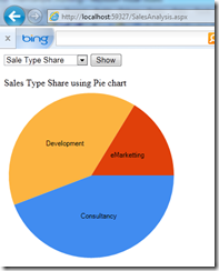
Generate Chart for sales type share
Now for generating the chart according to the sales type, you just need to change the SQL query and x and y values of the chart.
The Sql query used is “SELECT SUM(saleAmount) amount, SaleType from SalesData group by SaleType” and the X-Value is amount and Y-Values is SaleType.
s.XValueMember = "SaleType";
s.YValueMembers = "amount";
After modifying the above code with these, the following output is generated.
Generate Chart for sales progress over time period
For generating the progress of sale chart against sales amount / period, line chart is the ideal tool. In order to facilitate the line chart, you can use Chart Type as System.Web.UI.DataVisualization.Charting.SeriesChartType.Line. Also we need to retrieve the amount and sales date from the data source. I have used the following query to facilitate this.
“SELECT SaleAmount, SaleDate FROM SalesData”
The output for the line chart is as follows
Now you have seen how easily you can build various types of charts. Chart control is an excellent one that helps you to bring business intelligence to your applications. What I demonstrated in only a small part of what you can do with the chart control. Refer http://msdn.microsoft.com/en-us/library/dd456632.aspx for further reading.
If you want to get the project files in zip format, post your email below.
Hope you enjoyed reading this article.
© ASP.net Weblogs or respective owner
