Mobile Friendly Websites with CSS Media Queries
Posted
by dwahlin
on ASP.net Weblogs
See other posts from ASP.net Weblogs
or by dwahlin
Published on Mon, 25 Jun 2012 07:06:18 GMT
Indexed on
2012/06/25
9:16 UTC
Read the original article
Hit count: 1108
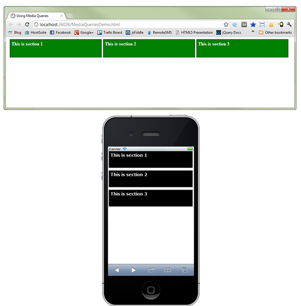
In a previous post the concept of CSS media queries was introduced and I discussed the fundamentals of how they can be used to target different screen sizes. I showed how they could be used to convert a 3-column wide page into a more vertical view of data that displays better on devices such as an iPhone:
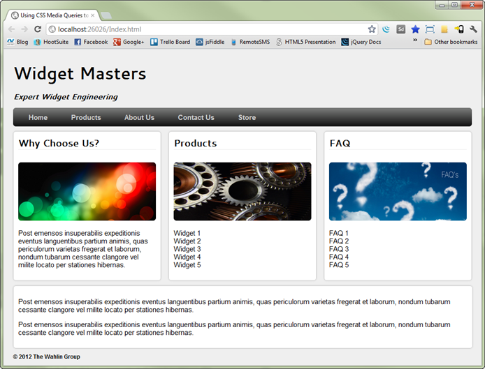
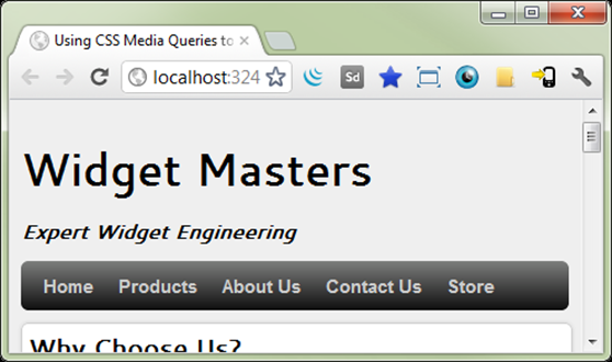
In this post I'll provide an additional look at how CSS media queries can be used to mobile-enable a sample site called "Widget Masters" without having to change any server-side code or HTML code. The site that will be discussed is shown next:
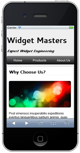
This site has some of the standard items shown in most websites today including a title area, menu bar, and sections where data is displayed. Without including CSS media queries the site is readable but has to be zoomed out to see everything on a mobile device, cuts-off some of the menu items, and requires horizontal scrolling to get to additional content. The following image shows what the site looks like on an iPhone. While the site works on mobile devices it's definitely not optimized for mobile.
Let's take a look at how CSS media queries can be used to override existing styles in the site based on different screen widths.
Adding CSS Media Queries into a Site
The Widget Masters Website relies on standard CSS combined with HTML5 elements to provide the layout shown earlier. For example, to layout the menu bar shown at the top of the page the nav element is used as shown next. A standard div element could certainly be used as well if desired.
<nav>
    <ul class="clearfix">
        <li><a href="#home">Home</a></li>
        <li><a href="#products">Products</a></li>
        <li><a href="#aboutus">About Us</a></li>
        <li><a href="#contactus">Contact Us</a></li>
        <li><a href="#store">Store</a></li>
    </ul>
</nav>
This HTML is combined with the CSS shown next to add a CSS3 gradient, handle the horizontal orientation, and add some general hover effects.
nav
{
    width: 100%;
}

nav ul
{
    border-radius: 6px;
    height: 40px;
    width: 100%;
    margin: 0;
    padding: 0;
    background: rgb(125,126,125); /* Old browsers */
    background: -moz-linear-gradient(top, rgba(125,126,125,1) 0%,
                rgba(14,14,14,1) 100%); /* FF3.6+ */
    background: -webkit-gradient(linear, left top, left bottom,
                color-stop(0%,rgba(125,126,125,1)),
                color-stop(100%,rgba(14,14,14,1))); /* Chrome,Safari4+ */
    background: -webkit-linear-gradient(top, rgba(125,126,125,1) 0%,
                rgba(14,14,14,1) 100%); /* Chrome10+,Safari5.1+ */
    background: -o-linear-gradient(top, rgba(125,126,125,1) 0%,
                rgba(14,14,14,1) 100%); /* Opera 11.10+ */
    background: -ms-linear-gradient(top, rgba(125,126,125,1) 0%,
                rgba(14,14,14,1) 100%); /* IE10+ */
    background: linear-gradient(top, rgba(125,126,125,1) 0%,
                rgba(14,14,14,1) 100%); /* W3C */
    filter: progid:DXImageTransform.Microsoft.gradient(
            startColorstr='#7d7e7d',
            endColorstr='#0e0e0e',GradientType=0 ); /* IE6-9 */
}

nav ul > li
{
    list-style: none;
    float: left;
    margin: 0;
    padding: 0;
}

nav ul > li:first-child
{
    margin-left: 8px;
}

nav ul > li > a
{
    color: #ccc;
    text-decoration: none;
    line-height: 2.8em;
    font-size: 0.95em;
    font-weight: bold;
    padding: 8px 25px 7px 25px;
    font-family: Arial, Helvetica, sans-serif;
}

nav ul > li a:hover
{
    background-color: rgba(0, 0, 0, 0.1);
    color: #fff;
}
When mobile devices hit the site the layout of the menu items needs to be adjusted so that they're all visible without having to swipe left or right to get to them. This type of modification can be accomplished using CSS media queries by targeting specific screen sizes. To start, a media query can be added into the site's CSS file as shown next:
@media screen and (max-width:320px) {

    /* CSS style overrides for this screen width go here */

}
This media query targets screens that have a maximum width of 320 pixels. Additional types of queries can also be added – refer to my previous post for more details as well as resources that can be used to test media queries in different devices. In that post I emphasize (and I'll emphasize again) that CSS media queries only modify the overall layout and look and feel of a site. They don't optimize the site as far as the size of the images or content sent to the device which is important to keep in mind.
To make the navigation menu more accessible on devices such as an iPhone or Android the CSS shown next can be used. This code changes the height of the menu from 40 pixels to 100%, takes off the li element floats, changes the line-height, and changes the margins.
@media screen and (max-width:320px)
{

    nav ul
    {
        height: 100%;
    }

    nav ul > li
    {
        float: none;
    }

    nav ul > li a
    {
        line-height: 1.5em;
    }

    nav ul > li:first-child
    {
        margin-left: 0px;
    }

    /* Additional CSS overrides go here */

}
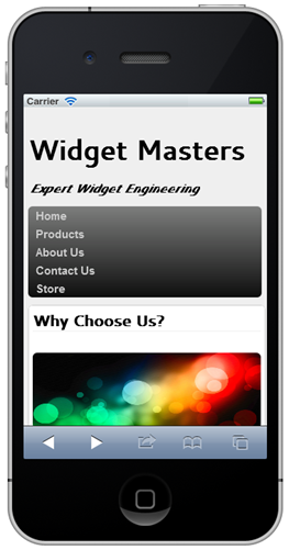
The following image shows an example of what the menu look like when run on a device with a width of 320 pixels:
Mobile devices with a maximum width of 480 pixels need different CSS styles applied since they have 160 additional pixels of width. This can be done by adding a new CSS media query into the stylesheet as shown next. Looking through the CSS you'll see that only a minimal override is added to adjust the padding of anchor tags since the menu fits by default in this screen width.
@media screen and (max-width: 480px)
{

    nav ul > li > a
    {
        padding: 8px 10px 7px 10px;
    }

}
Running the site on a device with 480 pixels results in the menu shown next being rendered. Notice that the space between the menu items is much smaller compared to what was shown when the main site loads in a standard browser.
In addition to modifying the menu, the 3 horizontal content sections shown earlier can be changed from a horizontal layout to a vertical layout so that they look good on a variety of smaller mobile devices and are easier to navigate by end users. The HTML5 article and section elements are used as containers for the 3 sections in the site as shown next:
<article class="clearfix">
    <section id="info">
        <header>Why Choose Us?</header>
        <br />
        <img id="mainImage" src="Images/ArticleImage.png" title="Article Image" />
        <p>
            Post emensos insuperabilis expeditionis eventus languentibus partium animis, quas
            periculorum varietas fregerat et laborum, nondum tubarum cessante clangore vel milite
            locato per stationes hibernas.
        </p>
    </section>
    <section id="products">
        <header>Products</header>
        <br />
        <img id="gearsImage" src="Images/Gears.png" title="Article Image" />
        <p>
            <ul>
                <li>Widget 1</li>
                <li>Widget 2</li>
                <li>Widget 3</li>
                <li>Widget 4</li>
                <li>Widget 5</li>
            </ul>
        </p>
    </section>
    <section id="FAQ">
        <header>FAQ</header>
        <br />
        <img id="faqImage" src="Images/faq.png" title="Article Image" />
        <p>
            <ul>
                <li>FAQ 1</li>
                <li>FAQ 2</li>
                <li>FAQ 3</li>
                <li>FAQ 4</li>
                <li>FAQ 5</li>
            </ul>
        </p>
    </section>
</article>
To force the sections into a vertical layout for smaller mobile devices the CSS styles shown next can be added into the media queries targeting 320 pixel and 480 pixel widths. Styles to target the display size of the images in each section are also included. It's important to note that the original image is still being downloaded from the server and isn't being optimized in any way for the mobile device. It's certainly possible for the CSS to include URL information for a mobile-optimized image if desired.
@media screen and (max-width:320px)
{

    section
    {
        float: none;
        width: 97%;
        margin: 0px;
        padding: 5px;
    }

    #wrapper
    {
        padding: 5px;
        width: 96%;
    }

    #mainImage, #gearsImage, #faqImage
    {
        width: 100%;
        height: 100px;
    }

}

@media screen and (max-width: 480px)
{

    section
    {
        float: none;
        width: 98%;
        margin: 0px 0px 10px 0px;
        padding: 5px;
    }

    article > section:last-child
    {
        margin-right: 0px;
        float: none;
    }

    #bottomSection
    {
        width: 99%;
    }

    #wrapper
    {
        padding: 5px;
        width: 96%;
    }

    #mainImage, #gearsImage, #faqImage
    {
        width: 100%;
        height: 100px;
    }

}
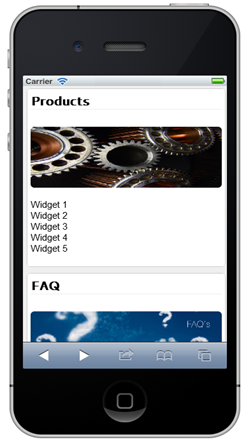
The following images show the site rendered on an iPhone with the CSS media queries in place. Each of the sections now displays vertically making it much easier for the user to access them. Images inside of each section also scale appropriately to fit properly.
 |
 |
CSS media queries provide a great way to override default styles in a website and target devices with different resolutions. In this post you've seen how CSS media queries can be used to convert a standard browser-based site into a site that is more accessible to mobile users. Although much more can be done to optimize sites for mobile, CSS media queries provide a nice starting point if you don't have the time or resources to create mobile-specific versions of sites.
© ASP.net Weblogs or respective owner
