Adventures in Windows 8: Placing items in a GridView with a ColumnSpan or RowSpan
Posted
by Laurent Bugnion
on Geeks with Blogs
See other posts from Geeks with Blogs
or by Laurent Bugnion
Published on Sat, 01 Sep 2012 13:19:52 GMT
Indexed on
2012/09/01
15:38 UTC
Read the original article
Hit count: 463
Currently working on a Windows 8 app for an important client, I will be writing about small issues, tips and tricks, ideas and whatever occurs to me during the development and the integration of this app.
When working with a GridView, it is quite common to use a VariableSizedWrapGrid as the ItemsPanel. This creates a nice flowing layout which will auto-adapt for various resolutions.
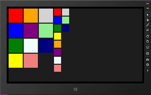
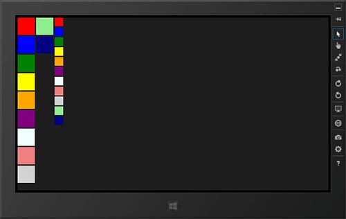
This is ideal when you want to build views like the Windows 8 start menu.
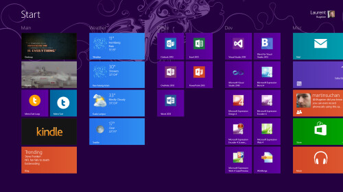
However immediately we notice that the Start menu allows to place items on one column (Smaller) or two columns (Larger). This switch happens through the AppBar. So how do we implement that in our app?
Using ColumnSpan and RowSpan
When you use a VariableSizedWrapGrid directly in your XAML, you can attach the VariableSizedWrapGrid.ColumnSpan and VariableSizedWrapGrid.RowSpan attached properties directly to an item to create the desired effect. For instance this code create this output (shown in Blend but it runs just the same):
<VariableSizedWrapGrid ItemHeight="100"
                       ItemWidth="100"
                       Width="200"
                       Orientation="Horizontal">
    <Rectangle Fill="Purple" />
    <Rectangle Fill="Orange" />
    <Rectangle Fill="Yellow" VariableSizedWrapGrid.ColumnSpan="2" />
    <Rectangle Fill="Red"
               VariableSizedWrapGrid.ColumnSpan="2"
               VariableSizedWrapGrid.RowSpan="2" />
    <Rectangle Fill="Green" VariableSizedWrapGrid.RowSpan="2" />
    <Rectangle Fill="Blue" />
    <Rectangle Fill="LightGray" />
</VariableSizedWrapGrid>
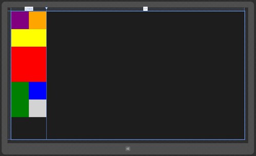
Using the VariableSizedWrapGrid as ItemsPanel
When you use a GridView however, you typically bind the ItemsSource property to a collection, for example in a viewmodel. In that case, you want to be able to switch the ColumnSpan and RowSpan depending on properties on the item. I tried to find a way to bind the VariableSizedWrapGrid.ColumnSpan attached property on the GridView’s ItemContainerStyle template to an observable property on the item, but it didn’t work. Instead, I decided to use a StyleSelector to switch the GridViewItem’s style. Here’s how:
First I added my two GridViews to my XAML as follows:
<Page.Resources>
    <local:MainViewModel x:Key="Main" />
    <DataTemplate x:Key="DataTemplate1">
        <Grid Background="{Binding Brush}">
            <TextBlock Text="{Binding BrushCode}" />
        </Grid>
    </DataTemplate>
</Page.Resources>

<Page.DataContext>
    <Binding Source="{StaticResource Main}" />
</Page.DataContext>

<Grid Background="{StaticResource ApplicationPageBackgroundThemeBrush}"
        Margin="20">
    <Grid.ColumnDefinitions>
        <ColumnDefinition Width="Auto" />
        <ColumnDefinition Width="*" />
    </Grid.ColumnDefinitions>

    <GridView ItemsSource="{Binding Items}"
              ItemTemplate="{StaticResource DataTemplate1}"
              VerticalAlignment="Top">
        <GridView.ItemsPanel>
            <ItemsPanelTemplate>
                <VariableSizedWrapGrid ItemHeight="150"
                                       ItemWidth="150" />
            </ItemsPanelTemplate>
        </GridView.ItemsPanel>
    </GridView>

    <GridView Grid.Column="1"
              ItemsSource="{Binding Items}"
              ItemTemplate="{StaticResource DataTemplate1}"
              VerticalAlignment="Top">
        <GridView.ItemsPanel>
            <ItemsPanelTemplate>
                <VariableSizedWrapGrid ItemHeight="100"
                                       ItemWidth="100" />
            </ItemsPanelTemplate>
        </GridView.ItemsPanel>
    </GridView>
</Grid>
The MainViewModel looks like this:
public class MainViewModel
{
    public IList<Item> Items
    {
        get;
        private set;
    }

    public MainViewModel()
    {
        Items = new List<Item>
        {
            new Item
            {
                Brush = new SolidColorBrush(Colors.Red)
            },
            new Item
            {
                Brush = new SolidColorBrush(Colors.Blue)
            },
            new Item
            {
                Brush = new SolidColorBrush(Colors.Green),
            },

            // And more...
        };
    }
}
As for the Item class, I am using an MVVM Light ObservableObject but you can use your own simple implementation of INotifyPropertyChanged of course:
public class Item : ObservableObject
{
    public const string ColSpanPropertyName = "ColSpan";

    private int _colSpan = 1;

    public int ColSpan
    {
        get
        {
            return _colSpan;
        }
        set
        {
            Set(ColSpanPropertyName, ref _colSpan, value);
        }
    }

    public SolidColorBrush Brush
    {
        get;
        set;
    }

    public string BrushCode
    {
        get
        {
            return Brush.Color.ToString();
        }
    }
}
Then I copied the GridViewItem’s style locally. To do this, I use Expression Blend’s functionality. It has the disadvantage to copy a large portion of XAML to your application, but the HUGE advantage to allow you to change the look and feel of your GridViewItem everywhere in the application. For example, you can change the selection chrome, the item’s alignments and many other properties. Actually everytime I use a ListBox, ListView or any other data control, I typically copy the item style to a resource dictionary in my application and I tweak it.
Note that Blend for Windows 8 apps is automatically installed with every edition of Visual Studio 2012 (including Express) so you have no excuses anymore not to use Blend :)
- Open MainPage.xaml in Expression Blend by right clicking on the MainPage.xaml file in the Solution Explorer and selecting Open in Blend from the context menu. Note that the items do not look very nice! The reason is that the default ItemContainerStyle sets the content’s alignment to “Center” which I never quite understood. Seems to me that you rather want the content to be stretched, but anyway it is easy to change.
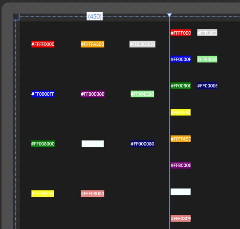
- Right click on the GridView on the left and select Edit Additional Templates, Edit Generated Item Container (ItemContainerStyle), Edit a Copy.

- In the Create Style Resource dialog, enter the name “DefaultGridViewItemStyle”, select “Application” and press OK.
Side note 1: You need to save in a global resource dictionary because later we will need to retrieve that Style from a global location.
Side note 2": I would rather copy the style to an external resource dictionary that I link into the App.xaml file, but I want to keep things simple here.
Blend switches in Template edit mode. The template you are editing now is inside the ItemContainerStyle and will govern the appearance of your items. This is where, for instance, the “checked” chrome is defined, and where you can alter it if you need to. Note that you can reuse this style for all your GridViews even if you use a different DataTemplate for your items. Makes sense? I probably need to think about writing another blog post dedicated to the ItemContainerStyle :)
- In the breadcrumb bar on top of the page, click on the style icon. The property we want to change now can be changed in the Style instead of the Template, which is a better idea.

- Blend is not in Style edit mode, as you can see in the Objects and Timeline pane. In the Properties pane, in the Search box, enter the word “content”. This will filter all the properties containing that partial string, including the two we are interested in: HorizontalContentAlignment and VerticalContentAlignment.
- Set these two values to “Stretch” instead of the default “Center”.
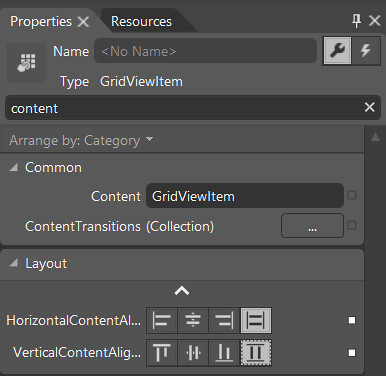
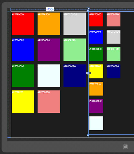
- Using the breadcrumb bar again, set the scope back to the Page (by clicking on the first crumb on the left). Notice how the items are now showing as squares in the first GridView.
- We will now use the same ItemContainerStyle for the second GridView. To do this, right click on the second GridView and select Edit Additional Templates, Edit Generate Item Container, Apply Resource, DefaultGridViewItemStyle.

The page now looks nicer:
And now for the ColumnSpan!
So now, let’s change the ColumnSpan property. First, let’s define a new Style that inherits the ItemContainerStyle we created before.
- Make sure that you save everything in Blend by pressing Ctrl-Shift-S.
- Open App.xaml in Visual Studio.
- Below the newly created DefaultGridViewItemStyle resource, add the following style:
<Style x:Key="WideGridViewItemStyle"
       TargetType="GridViewItem"
       BasedOn="{StaticResource DefaultGridViewItemStyle}">
    <Setter Property="VariableSizedWrapGrid.ColumnSpan"
            Value="2" />
</Style>
- Add a new class to the project, and name it MainItemStyleSelector.
- Implement the class as follows:
public class MainItemStyleSelector : StyleSelector
{
    protected override Style SelectStyleCore(object item, DependencyObject container)
    {
        var i = (Item)item;

        if (i.ColSpan == 2)
        {
            return Application.Current.Resources["WideGridViewItemStyle"] as Style;
        }

        return Application.Current.Resources["DefaultGridViewItemStyle"] as Style;
    }
}
- In MainPage.xaml, add a resource to the Page.Resources section:
<local:MainItemStyleSelector x:Key="MainItemStyleSelector" />
- In MainPage.xaml, replace the ItemContainerStyle property on the first GridView with the ItemContainerStyleSelector property, pointing to the StaticResource we just defined.
<GridView ItemsSource="{Binding Items}"
          ItemTemplate="{StaticResource DataTemplate1}"
          VerticalAlignment="Top"
          ItemContainerStyleSelector="{StaticResource MainItemStyleSelector}">
    <GridView.ItemsPanel>
        <ItemsPanelTemplate>
            <VariableSizedWrapGrid ItemHeight="150"
                                   ItemWidth="150" />
        </ItemsPanelTemplate>
    </GridView.ItemsPanel>
</GridView>
- Do the same for the second GridView as well.
- Finally, in the MainViewModel, change the ColumnSpan property on the 3rd Item to 2.
new Item
{
    Brush = new SolidColorBrush(Colors.Green),
    ColSpan = 2
},
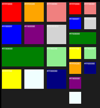
Running the application now creates the following image, which is what we wanted. Notice how the green item is now a “wide tile”.
You can also experiment by creating different Styles, all inheriting the DefaultGridViewItemStyle and using different values of RowSpan for instance. This will allow you to create any layout you want, while leaving the heavy lifting of “flowing the layout” to the GridView control.
What about changing these values dynamically?
Of course as we can see in the Start menu, it would be nice to be able to change the ColumnSpan and maybe even the RowSpan values at runtime. Unfortunately at this time I have not found a good way to do that. I am investigating however and will make sure to post a follow up when I find what I am looking for!
© Geeks with Blogs or respective owner
